Building long-term, scalable pattern libraries
Timeline
2023 - Adventures by Disney and National Geographic 2024 - Disney Institute
Key Skills
Wireframing, Prototyping, Sprint + process management, Accessibility, Design systems, Engineering collaboration
Disney was in the process of migrating brands to a single site management system for more consistent experiences, in addition to smoother management for site producers. Kicking off this multi-brand effort, the acquisition of National Geographic Expeditions allowed space for branding alignment with Adventures by Disney, while simultaneously converting both sites to AEM.
Paving the way for other migrations, NatGeo and ABD allowed design to begin a skeleton of components in AEM that other brands, including Disney Institute, could build on.
My Role
As one of two product designers on these AEM efforts, my role was to first analyze the brands’ components, design systems, and brand guidelines. From there, I was responsible for designing new components, building page designs, creating and developing our new component library and style guides alongside Engineering, and facilitating communications with tech teams and stakeholders. I also continued design updates, performed accessibility audits, and worked alongside stakeholders to maintain sustainment efforts.
Tools
Figma, Hyperion, WCAG AA + AAA, Atomic

Our Users
Design Initiatives
01
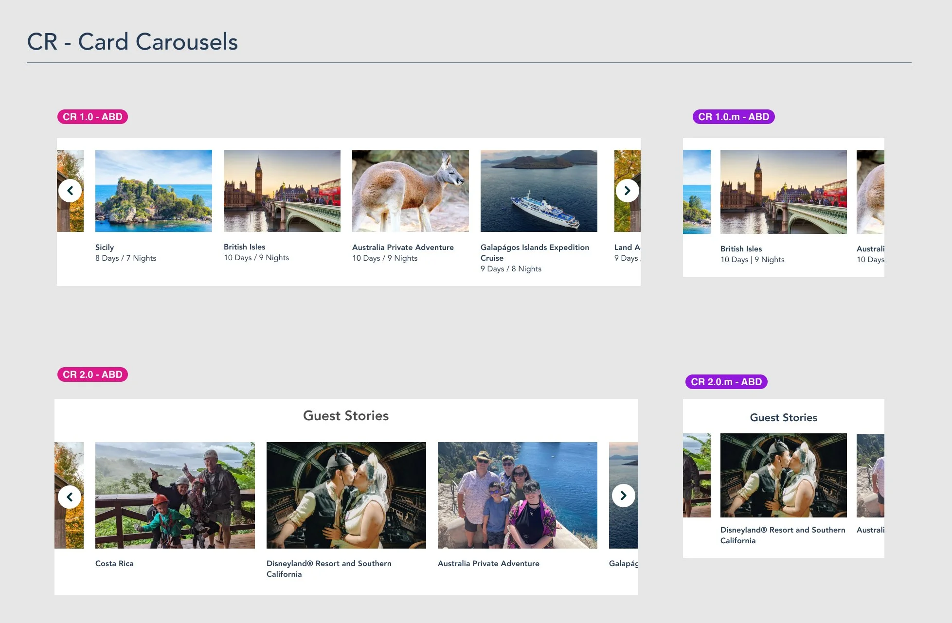
Starting with ABD, migrating both brands to AEM would streamline future updates and management. Creating components that could mold to whatever brand producer’s were building for would take a huge load from design teams.
02
Improve the visual style of the current sites, update outdated flows, refine accessibility, and not only align components to the newer Hyperion design system but also align brand identities to their respective UI.
01
For a project like this, our main users were website producers. These were the people day in and out using AEM to build new web pages for these brands. Secondary users included project managers and design, as they would be the ones involved in this new workflow.
02
As we go through the migration process for each brand, we would aim to tweak and improve each step into a defined standard for future initiatives, both for the project managers, producers, and designers.
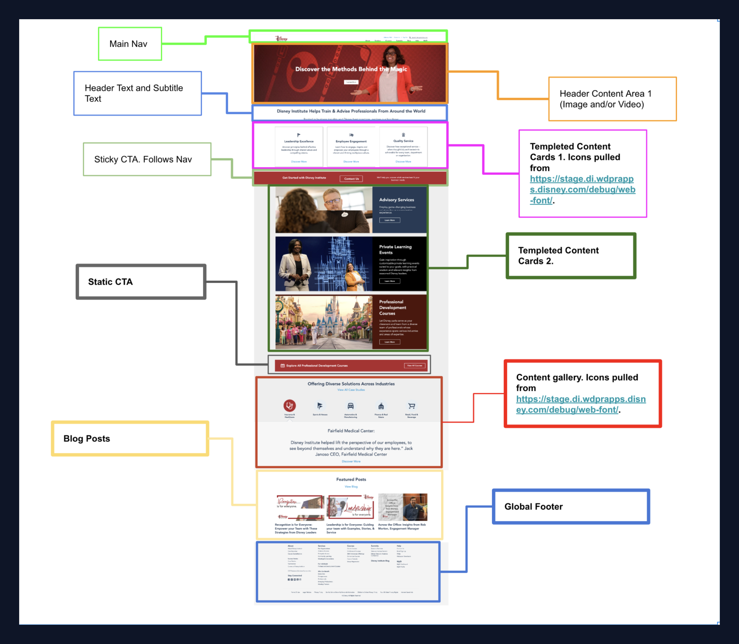
First Migration Process
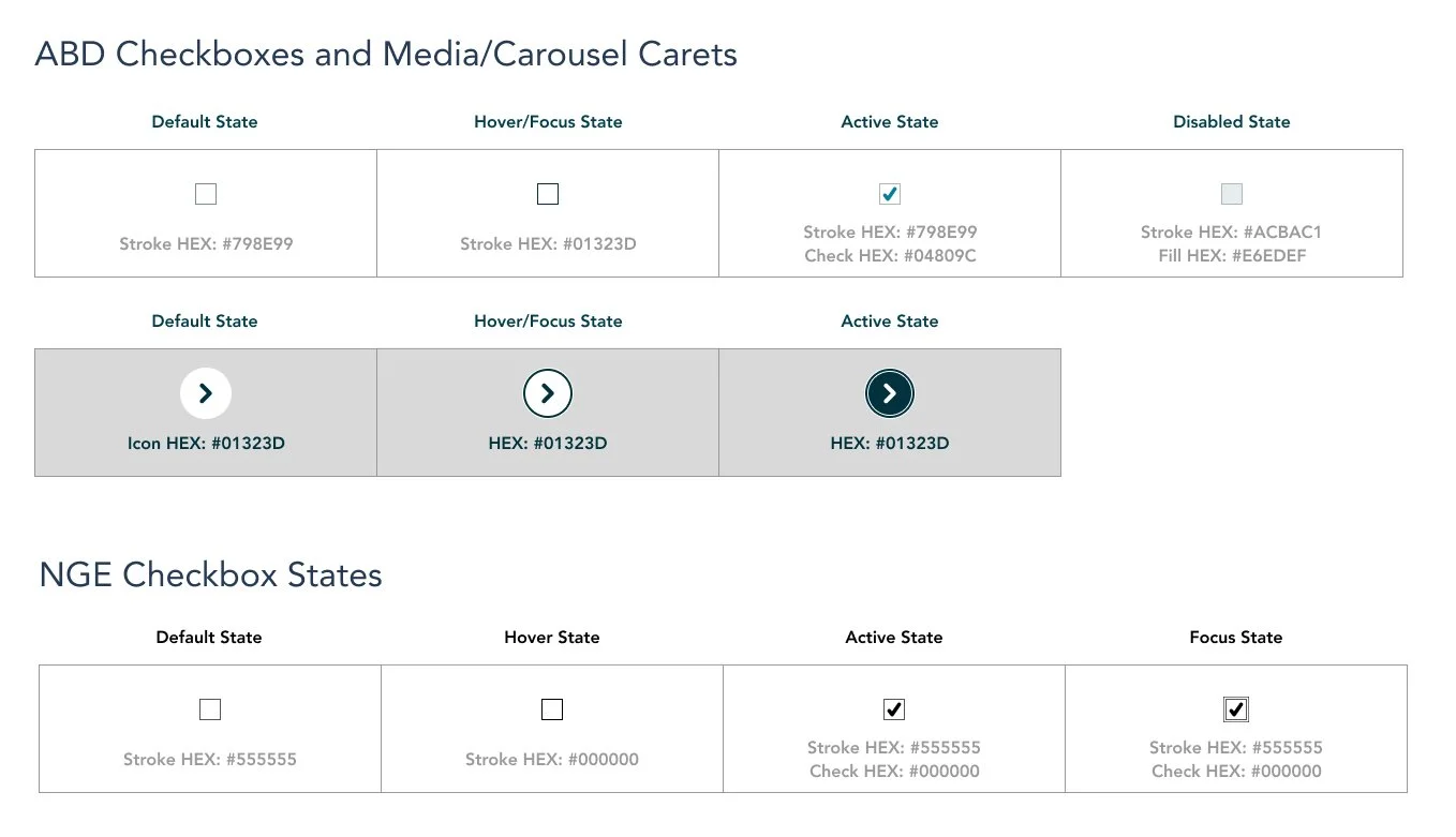
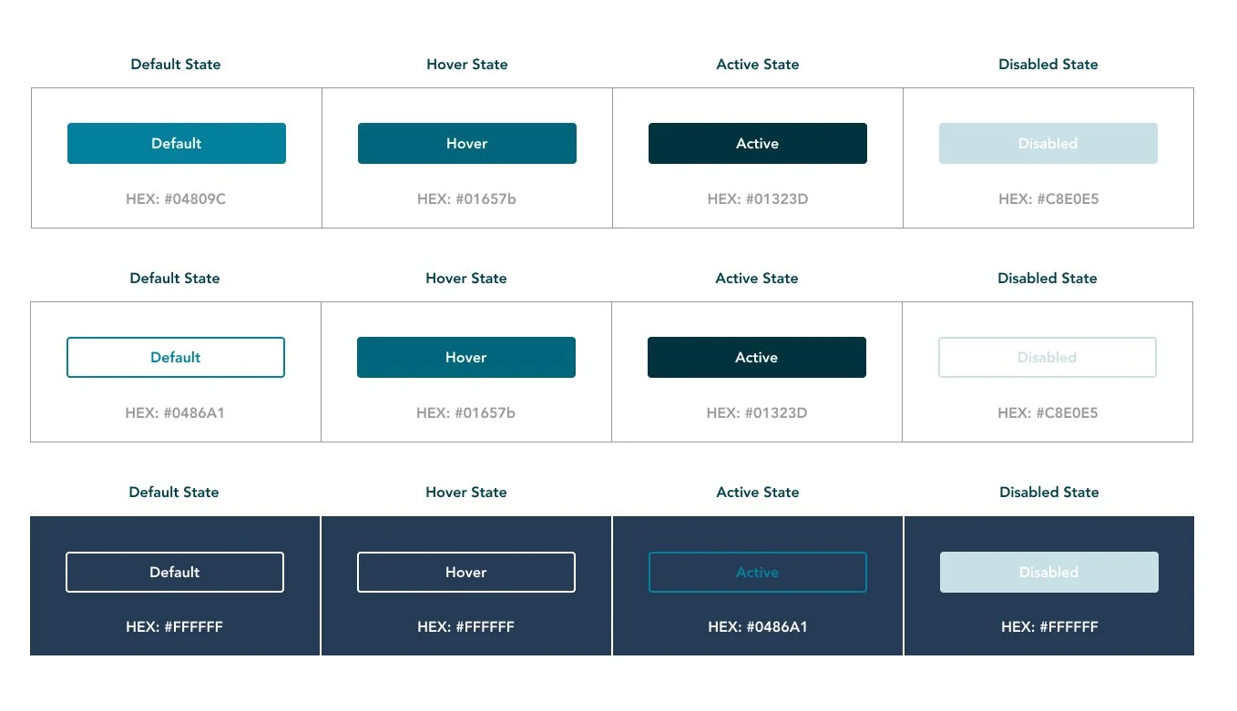
Our first step was to get an understanding of the current state of each website’s live component library. Through what we called Content Mapping, Design and Product were able to gauge what would be carried over in the updates as is, modified, or what could be scratched entirely. We determined this by looking at a few factors of each component…
01
What type of information does the component aim to display— is it a media player, image carousel, paragraph alongside an image… etc.
02
Is this component flexible across brands? For example, a component for Storyliving by Disney might be heavily focused on imagery given what the brand portrays, and might not be useful for information or process-dense, like a majority of Disney’s secondary brands like ABD or Disney Institute.
03
How up to date is the component? Does is align with our current accessibility standards and Hyperion?
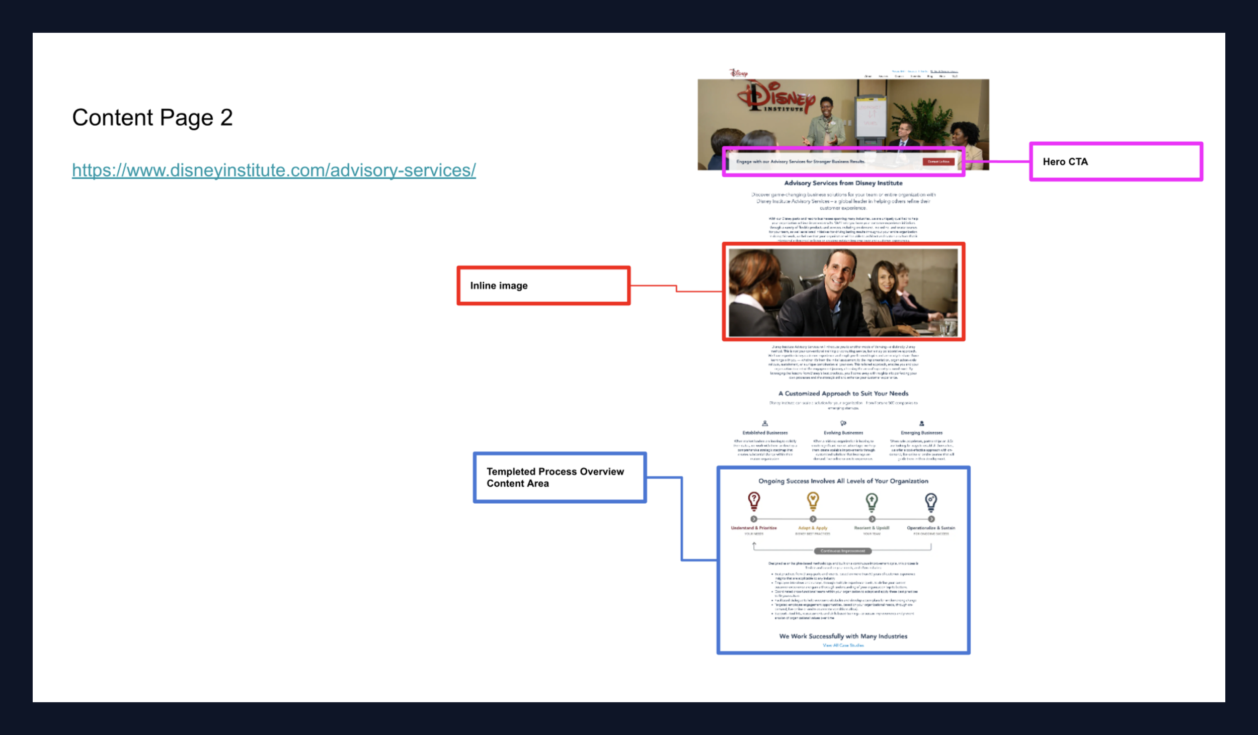


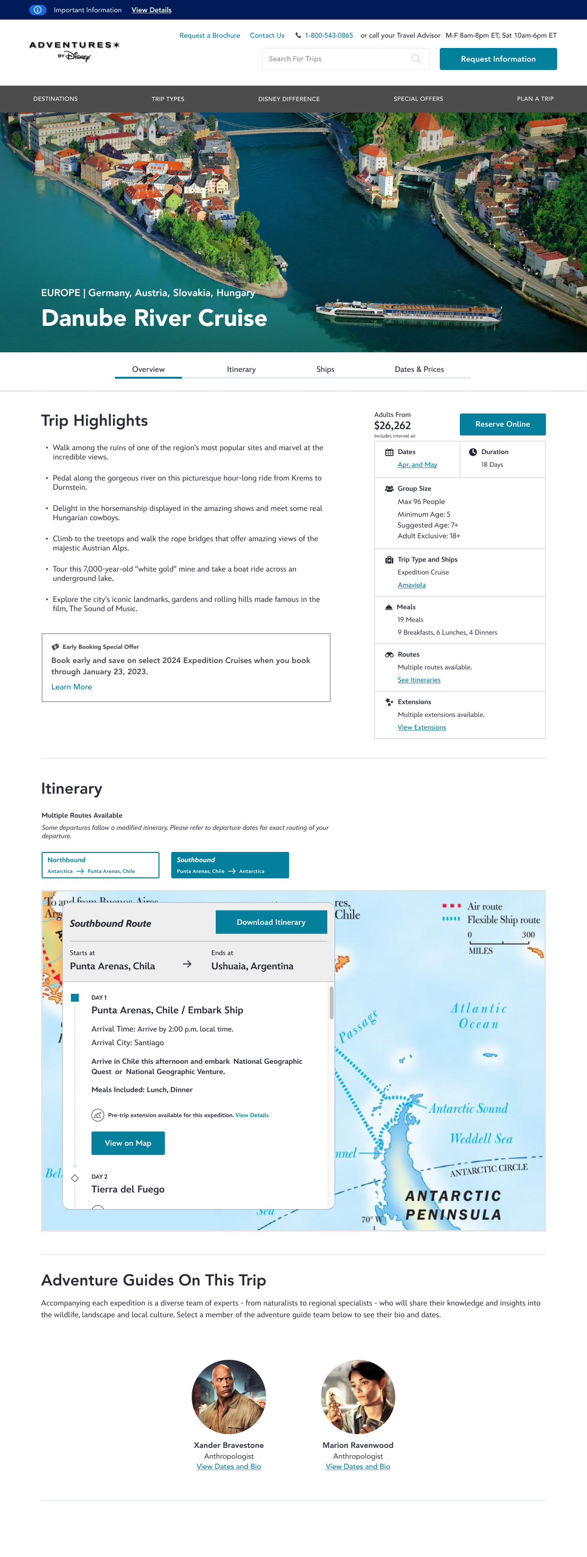
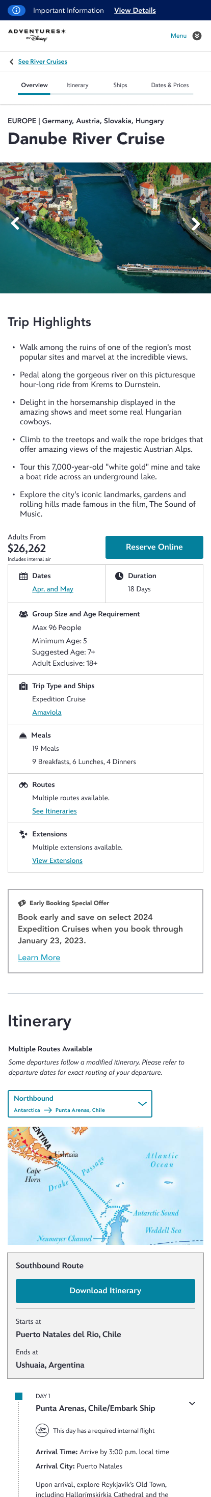
While the root of Adobe Experience Manager is individual components, our goal was to stay away from designing in a vacuum. To avoid this, I began by pulling pages that held the most variety of components and started wireframing at that level. That way, we could see the context in which each component would live and how it interacted with all the content on the page, sometimes influencing how we would display information within it.
For all brands, I usually started with the Homepage, Itinerary (ABD + NatGeo) or About page (Disney Institute), and continued from there. After designing components for large/main pages, I would then focus on growing the component library/ mini-design system, adding individual components as needed.
Design Solution Overview
01 The Problem
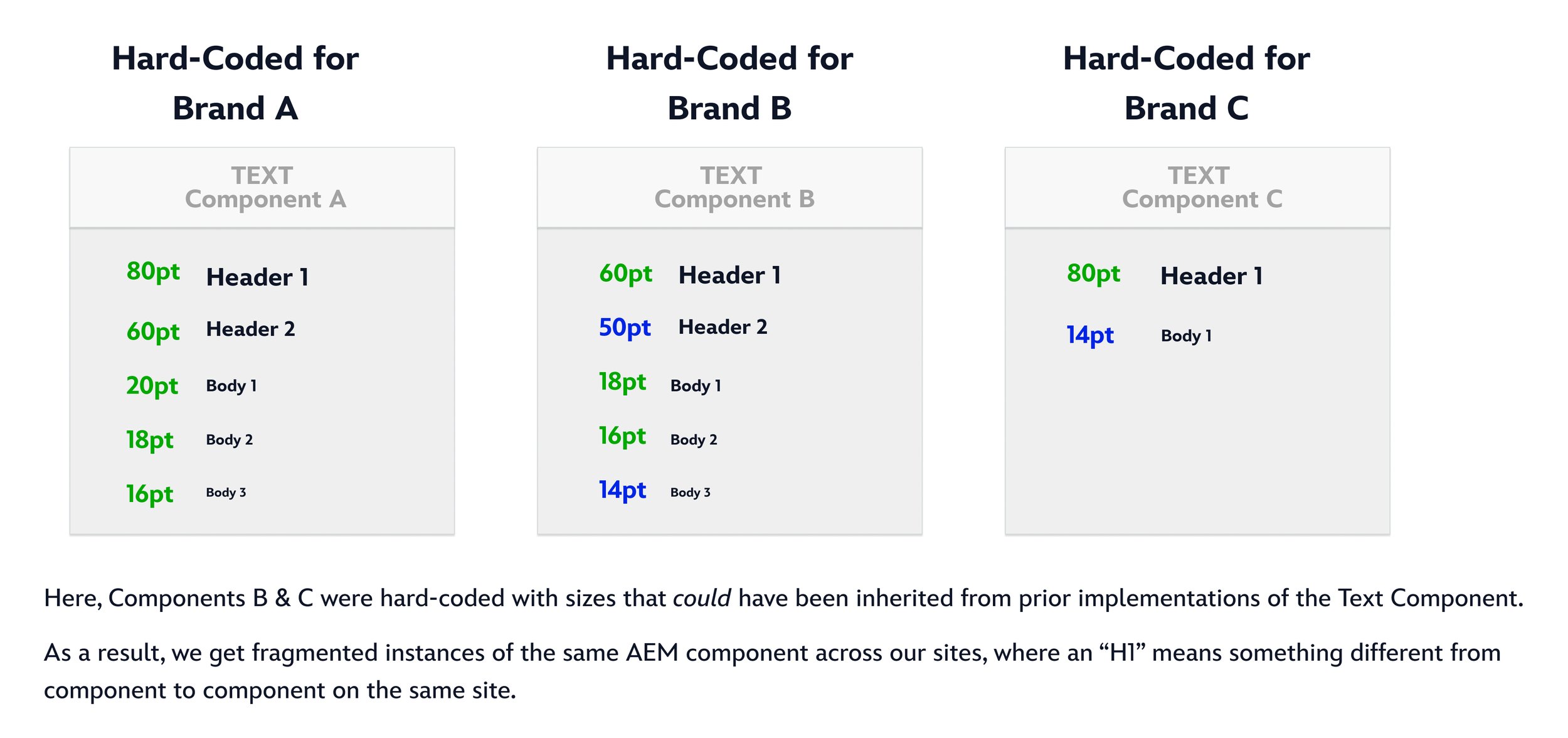
Today, we are seeing instances where components are using hard-coded text styles (sizes, weights, colors), with variations appearing on an ad-hoc basis.
This is causing fragmentation and re-work when trying to re-use components from our AEM library.
02 Solution
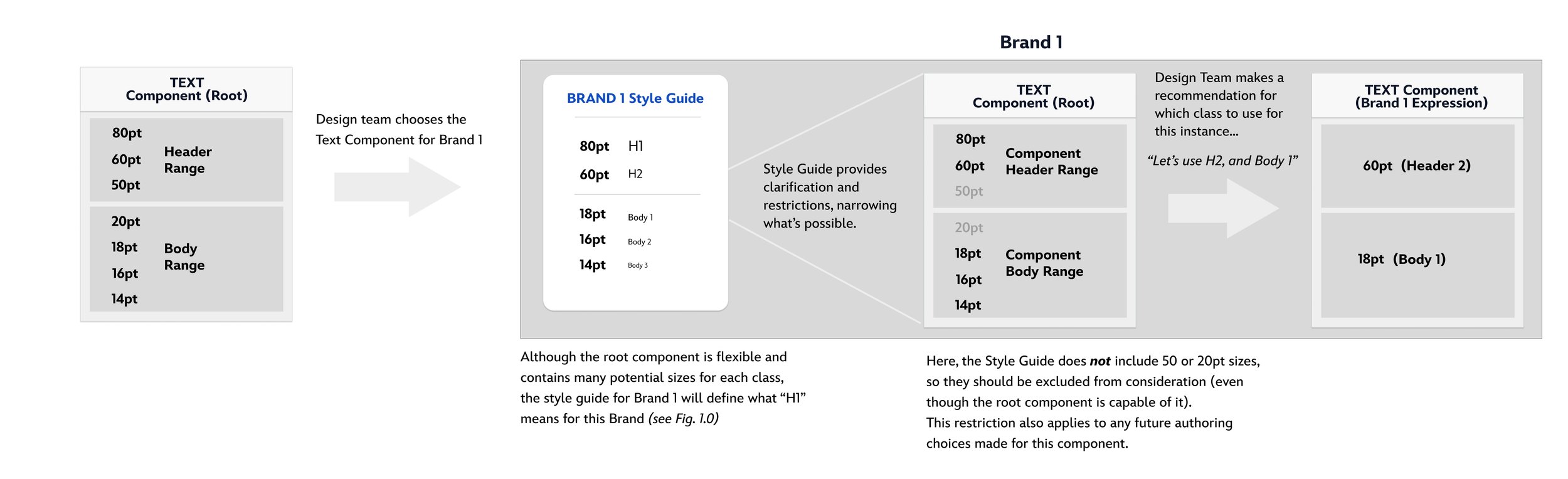
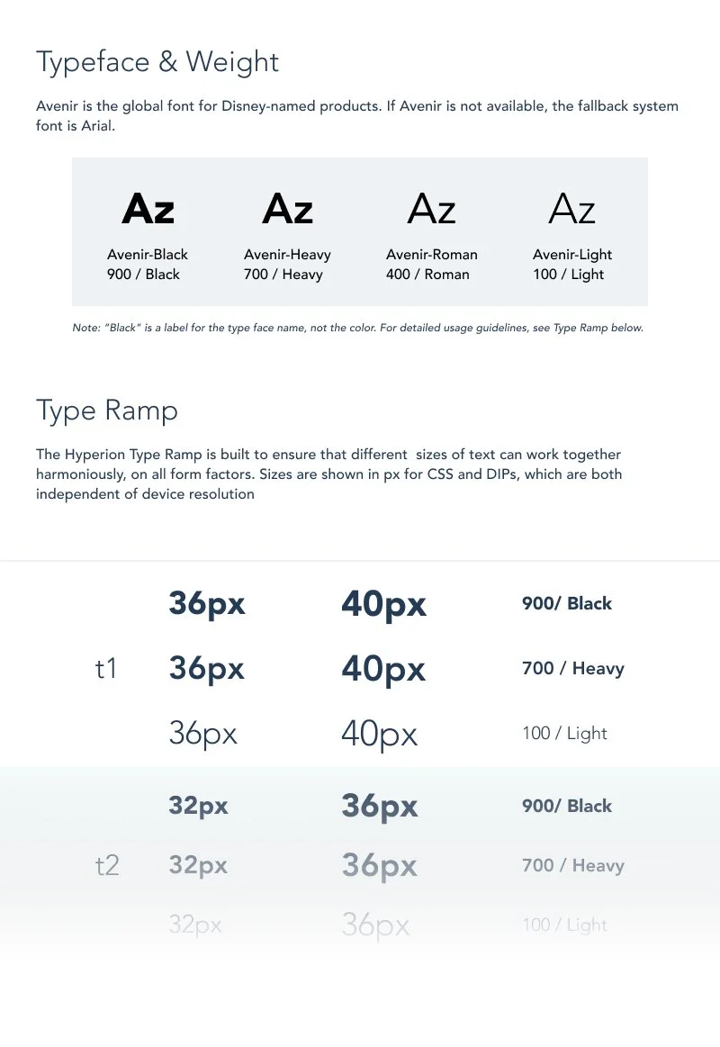
We should combine all possible text sizes into a range of options that will correspond to a class of text (H1, H2, Subheader 1, Subheader 2, Body 1, etc.). These ranges would be defined at the root component level and as point sizes– agnostic of class.
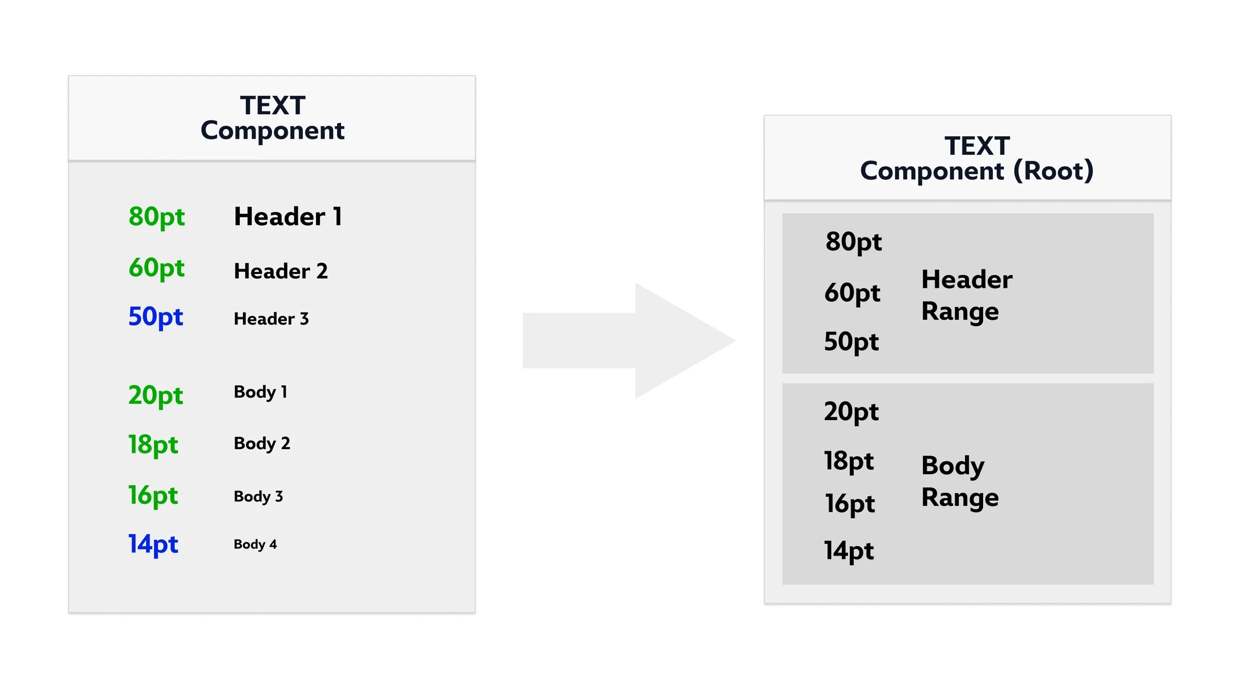
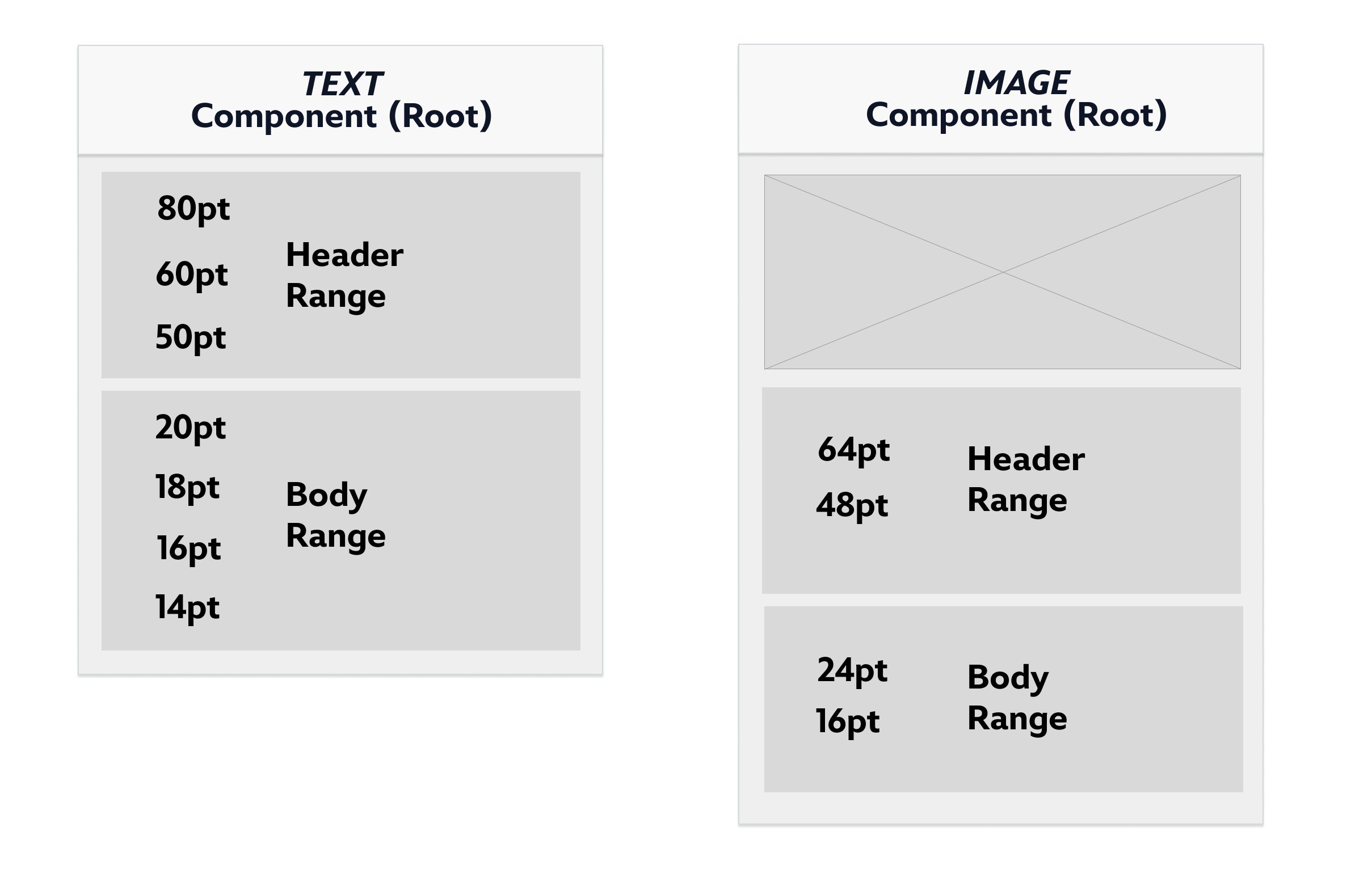
Here, we see an “Image Component” that doesn’t need as many options as something like a “Text Component”, so it uses a smaller range of potential sizes for it’s classes. Different components may require different ranges depending on their needs.
03 In Practice
With a style guide, we can define which point sizes should apply to each text class- this would comprise a text RANGE for a given brand. With Design Team guidance, we can choose which specific sizes to use in any given instance of that component.
04 Future Scaling
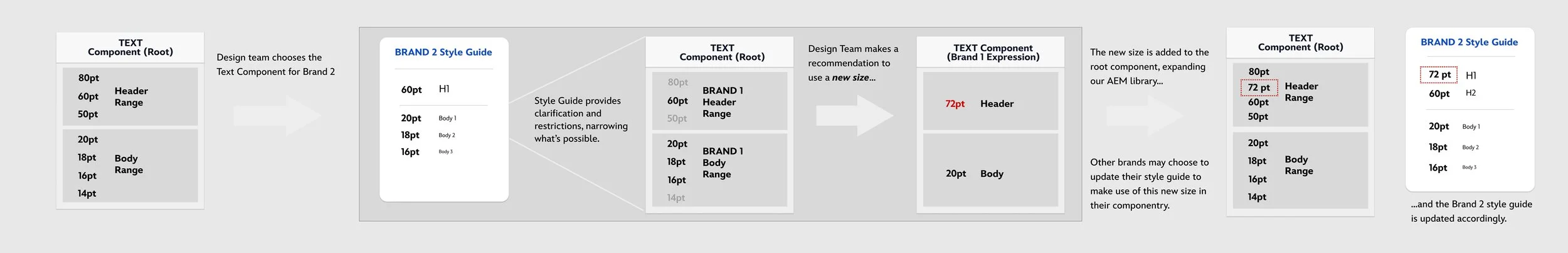
If a Brand requires a text size that does not exist in the root component, we should add it to the root component, allowing all Brands to access it in the future.
05 Final Experience
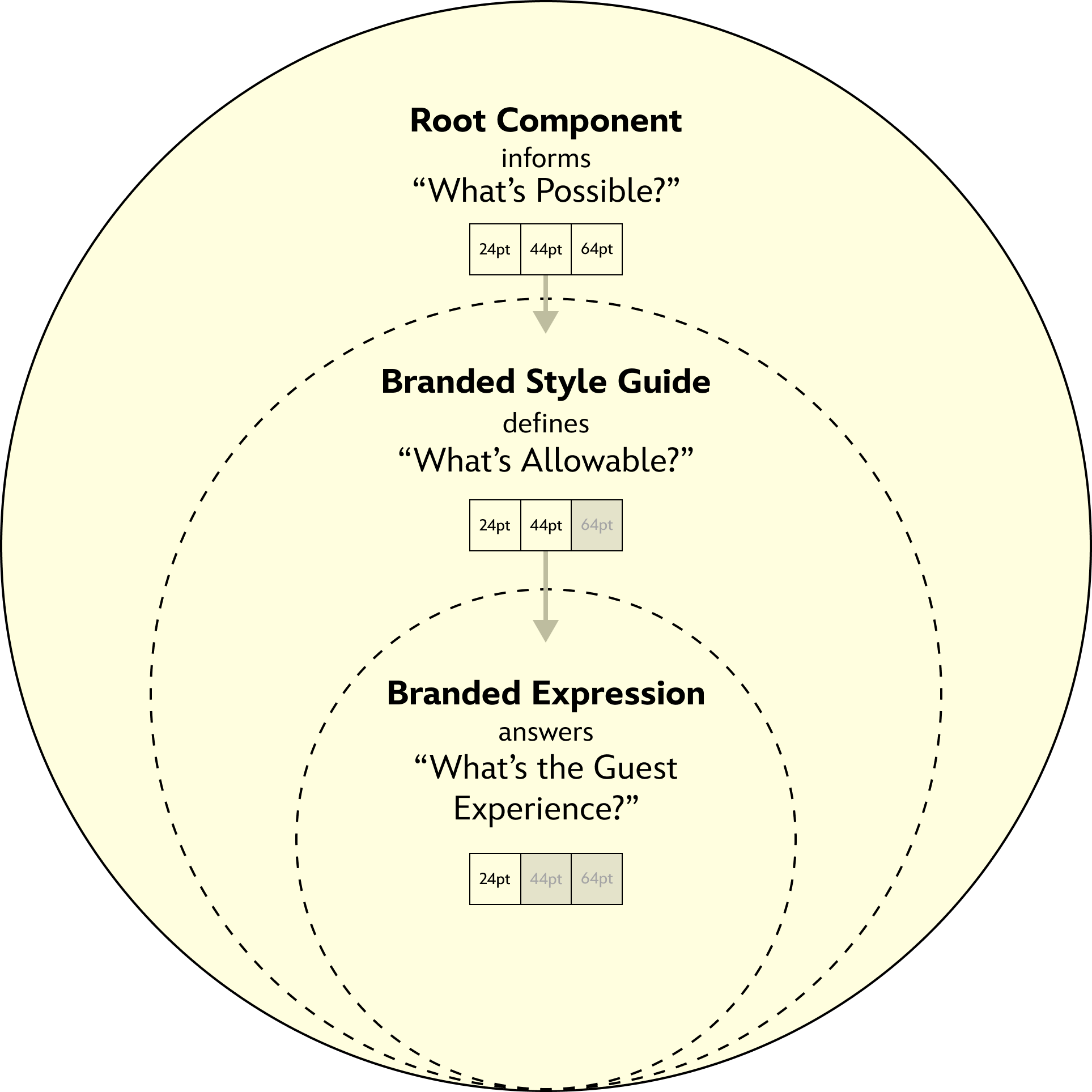
The relationship between a Root Component and the final Brand Expression of that component involves a set of narrowing options in the form of style guides and design choices– all tailor-made by the Design Team to fit that particular Brand.

Sustainment
After building page templates and standing up brand + component libraries, I remained active in the development phases as a design point of contact for each brand migration. This included:
Facilitating accessibility audits (Adhering to WCAG 2.1 AA).
Pivoting and updating designs as needed alongside tech development.
Designing one-off components to merge into AEM and additional page templates (Form pages, “Campaign” pages… etc.).
Constraints
Commonly experienced, one of our main constraints was project timeline and budgeting allocated for both design and tech. Certain design ‘wins’ were corralled into specific phases of project release.
To alleviate this, we kept an open line of communication with product leaders and tech to allow continuous updates to component and page designs when needed, managing expectations and voicing our concerns when current designs might affect future guest-flows.